How we approached accessibility for Learnosity

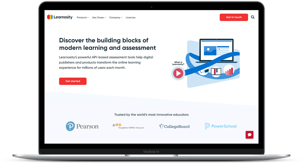
Learnosity is a Dublin-based B2B ‘EdTech’ software company with global offices in New York, Los Angeles & Sydney.
Having raised an $18m private equity round in 2018, Learnosity approached 93digital ready to go global and take on the world. What they needed next was a plan to transform their website into a strategic marketing machine that delivers impact and drives growth.
You can see the full Learnosity project case study here.
Accessibility is key for a modern website
Within the world of web development, accessibility is the practice of adding functionality to a web page which will improve its usability for users who have some sort of limitation which hinders their ability to fully consume the content on the page.
These limitations could be a disability the user has, such as blindness or limited motor skills. This can also be a technological limitation, such as viewing the site on an old device or browser which may not support some features of the web page. We live in a world where equality is of the utmost importance. It is only fair to allow anyone to view whatever content they wish within the public domain, regardless of who they are and what they can and can’t do.
The World Wide Web Consortium (W3C) are an international community who have developed a set of web standards. These standards are considered the de facto standards for web development. They include an extensive set of Web Content Accessibility Guidelines, which developers can refer to, to help guide them in their approach to making a site more accessible.
The WCAG guidelines have a series of different levels at which you can ‘meet’ accessibility standards, so rather than it being a case of ‘accessible’ or ‘not accessible’, it’s not so black or white. You really need to think of it as a sliding scale, so it’s up to you to what standard you are hoping to achieve.
Being in the education space, Learnosity were very keen to ensure their site was as accessible as possible. This was pleasing to see, as accessibility can often be overlooked and sadly, there are still millions of completely inaccessible websites out there whilst accessibility is often still low down the list of client priorities on new briefs we receive.
The 93digital team approach to accessibility
The 93digital WordPress development team approaches the question of accessibility in the same way for every website – to add accessibility based functionality wherever it is required, but taking a pragmatic approach inline with client requirements, user requirements and project timelines and budgets.
There are many practices that can be applied to improve the accessibility to a site. The main ones that the 93digital team focused on were:
- Adding appropriate ARIA labels to elements
- Ensuring correct tab indexes were added to elements
- Adding an easily visible focus states
- Using text and background colours which have a high enough contrast between them (from a design perspective)
ARIA labels are a set of HTML attributes used to help describe an element’s context, how its interacted with and its current state. Screen readers (used by those with visual disabilities to browse the web) use the information in these attributes to help the user, who may have a visual impairment, to understand how they can interact with the element, something which may be visually obvious for other users. ARIA labels are often added to page elements such as dropdowns, accordions, and tab panels.
Tab indexes relate to the order of ‘interactable’ elements on a page (links, buttons, inputs etc). The natural flow of tabbing through these elements matches their position within the HTML document. Developers can manipulate this order and even remove some elements from the tab list all together if appropriate.
Creating a main navigation menu that’s both accessible for keyboard-only, and has a high quality UI
The main navigation ‘mega menu’ is a complex set of dropdown submenus. In order to improve its accessibility for Learnosity, we had to ensure that the full menu was accessible to keyboard-only users while maintaining a high quality UI.
This required us to add a lot of state checks in the JavaScript which controls the menu. These checked for which submenus were visible and which weren’t. They also checked where the current focus state was within the menu, and how to handle the user tabbing between the different elements.
For instance, when focused on one of the main menu items, the user has the ability to click the ‘return’ or ‘space’ key to toggle the submenu’s visibility. Depending on its current visibility, it dictates which element is the next one available in the tab list. Consideration also had to be given to the short amount of time when the submenus are animating in-to and out-of view, i.e. how we handle a tabbing between elements during the animation to make sure everything still works smoothly and intuitively.
Although taking a fair amount of time, the 93digital team approached the task systematically, with a fair bit of bug testing, the end result was something that both the development team and the client were really happy with!
It’s worth thinking about accessibility within your project, as it needs to be planned for. The more accessible you need your project to be, the more time will be needed by your developers (and therefore in your budget), and it’s possible you might have to make some design sacrifices to achieve the highest tiers of web accessibility guidelines.

Internal day: March 2020

How to: Integrate Pardot & WordPress
Let's Talk
Do you have a web design and build project coming up that you would like to talk about?