Top 9 B2B web design trends for 2022


What makes for a good website design in 2022? Responsive design is a given. As is minimalism and plentiful white space. These trends aren’t going anywhere as they’re an inherent part of good UX design.
But as the world around us changes, so too does the digital landscape. And it’s happening very quickly. In order to keep up, you need a website that stays ahead of B2B web design trends.
In the following post, we’ll explore 9 ultra-modern website design trends for the B2B space, including:
- Mobile-first design
- Well-organised navigation
- Smarter chatbot customer service
- Home page data visualisations
- Trust marks
- Micro interactions
- Intentional animations
- Fast mobile page speeds
- Accessibility
Top 9 B2B web design trends for 2022
The world has changed significantly over the last couple of years. And B2B marketing practices have changed with it.
According to a recent McKinsey & Company report, 52% of B2B companies have moved away from in-person interactions with prospects since the start of the pandemic. Why? In part, because of this:
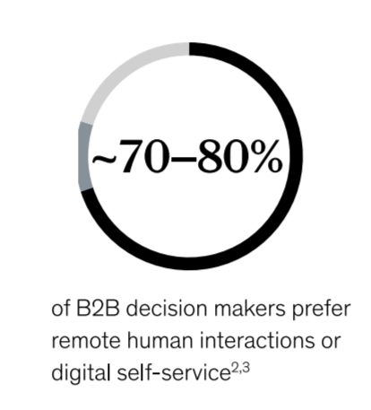
Over three-quarters of B2B decision-makers now prefer remote human interactions to face-to-face interactions and digital self-service to sales support calls.
That said, a preference for digital doesn’t necessarily mean that B2B prospects are going to be satisfied with any company that’s digitized its interactions, be it through the website, a live chat window, or a Zoom call. They have high expectations now that they’ve seen how fast, convenient, and streamlined digital experiences can be.
Since the website is often the first digital touchpoint a prospect has with your company, it needs to be able to meet, if not, exceed those expectations.
Staying on top of the latest and greatest B2B web design trends will help, as you’ll be designing the user journey for today’s B2B buyer — not yesterday’s. The more you can reduce the inefficiencies and frictions of the past (even if they weren’t problematic pre-2020), the better.
So, let’s take a look at what the top website trends are going to be along with some examples of B2B websites nailing those trends right now:
1. Mobile-first design
When Google updates its search algorithm, it isn’t an arbitrary thing. Google uses real user data and behaviour to determine what makes for the best user search experience. And when it updated its algorithm to prioritise mobile-first websites, its message was loud and clear:
Websites designed with smartphone users in mind provide the best overall user experience. Not only because mobile-first design caters to the majority of users, but because it leads to smarter design choices — like minimalism, concise messaging, and clickable interfaces.
For B2B and SaaS, this is especially important since the majority of first interactions might be on smartphones, but the majority of subsequent actions are likely to take place on a laptop or desktop computer. With mobile-first practices in place across all devices, every user will have a consistently positive experience with your site.
As for designing mobile-first websites, the designs don’t actually have to be identical on mobile and desktop. If you take a look at the AND.CO website on desktop vs. mobile, you’ll see why mobile-first design choices like full-width buttons, larger text, and accordion menus are more effective on smartphone screens.
2. Well-organised navigation
Because B2B websites often have dozens of pages, navigation plays an important role in the user experience. And while the header may provide you with enough room for all the top-level menus and drop-down links you have, that doesn’t mean it should all go up there.
Take Hootsuite, for example. Its header navigation contains only three top-level menus: Platform, Plans, and Resources. These three menus and the well-organised information within them give prospects everything they need in order to figure out if the SaaS is right for them. The remaining links can be found in the footer menu, leading to a more purpose-driven discovery and research phase.
3. Smarter chatbot customer service
Digital self-service is one of the things that B2B decision-makers want access to these days. There are a number of ways to offer this through a website. A knowledge base is one option, though it can take a lot of work to dig through, especially if the prospect is unfamiliar with your brand. A chatbot is another option. But not just any chatbot will do.
Just as consumers want their customer service to be fast and personalized, so too do B2B buyers. This means chatbots in 2022 and beyond need to be:
- Instantaneous
- Proactive
- AI-powered
- Available 24/7
Toast has a great one to model yours after. Not only is it designed to serve all of Toast’s different users, but it keeps talking to them and providing them with information while they wait for a human representative.
4. Home page data visualisations
Data visualisations are especially useful in SaaS marketing and sales, though they can be used on any type of B2B website. We’re not just talking about charts and graphs either.
By presenting important statistics in an infographic style, they’ll stand out much more than they would buried in a paragraph of text. What’s more, you can use other data visualisations to tell your B2B company’s story and explain some of its more complex processes. For instance, Asana uses an interactive timeline design to explain how creative teams can benefit from using the project management software.
5. Trust marks
The B2B sales cycle tends to take a while. And when you remove the in-person interactions from the equation, they may take even longer if you don’t find a modern alternative to build trust with.
In the case of a B2B website, you can use trust marks. They come in a variety of flavours:
- Social proof, like customer testimonials
- Logos of companies who are happy with your product
- Logos of partner companies that are super recognizable
- Logos and links to press promotion of your product
- Security trust seals — especially around your product pricing and checkout
It all depends on what your company does and what it’ll take to earn the trust and respect of prospects. Mitie, for instance, uses a number of trust marks throughout its home page. The first is a grey bar that appears below the hero image and shows off their high-profile customer logos. The next is an animated bar that shows the scale and contributions of their operation. And the last one is a bar that shows off various accolades they’ve earned.
6. Micro interactions
While flat designs can look really sleek and attractive, users sometimes have issues interacting with flat websites because it’s not always clear where the interactive elements are. One way to deal with this usability flaw is to add layers to the design. But if that doesn’t fit the look of your brand, micro interactions are another increasingly popular solution.
The ENABLIT website uses a combination of layered elements and uniquely designed micro interactions. When users engage with the interactive elements on the site, they encounter signals like rotating cards, sliding animations, and red dashed indicators. Not only does this make the website feel more alive, but it also builds more confidence in visitors as they know when and where to interact.
7. Intentional animations
There was a time when web designers animated websites simply for the sake of animating them. When it was a novel design trend, that may have been okay with some visitors. However, today’s B2B decision-makers don’t have time to waste. So, chances are good that unnecessary animations will be seen as pointless distractions.
Intentional animations, on the other hand, are definitely in fashion and will remain that way so long as they continue to improve the user experience.
Take a look at the Twilio example above. The home page includes animations at key points along the experience. There’s a blinking cursor animation on each of the “Sign up” buttons. There’s a pulse animation that calls attention to Twilio’s channels. There’s also a picture of a guy in sunglasses who follows the user down a list of communications icons. Each animation serves a clear purpose and is just enough to grab the user’s attention while reinforcing the branding.
8. Fast mobile page speeds
Just as Google has made mobile-first design one of its top ranking signals, so too has it prioritised mobile page speed. With the introduction of Core Web Vitals earlier this year, it doubled-down on its efforts to get everyone to speed up their mobile web pages.
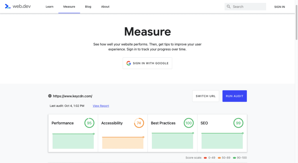
Websites like KeyCDN that are able to create an attractive, informative, and engaging B2B website design without sacrificing page speed will be rewarded by Google with a better ranking. And it makes sense why Google would do this when you look at the data showing the correlation between mobile page speeds and website abandonment rates.
So, websites that want to compete in search, as well as in the minds of prospects, will get their Performance scores as close to 100 as possible in 2022.
9. Accessibility
Accessibility is another issue that Google has brought front and centre with Core Web Vitals. It’s not just your website’s search ranking that’s at risk if you don’t make it accessible either. The number of web accessibility lawsuits is on the up and up. While the majority of those suits are against ecommerce sites, B2B companies can’t afford to take this matter lightly.
There’s a lot that needs to be done in order to make sure your website is in compliance with modern accessibility guidelines. Large fonts. Strong colour contrast. No autoplaying videos or music. You can use Core Web Vitals to see where your website’s biggest issues are and then use the Web Accessibility Initiative (WAI) website to make sure you’ve covered the rest.
We’re also going to see websites use tools like language switchers, font re-sizers, and dark mode toggles — like the one Hotjar has — to further accommodate individual users’ preferences.
Wrapping up
In order to compete in this digital-first B2B landscape, you need to provide prospects and users with a top-notch online experience. And it all starts with your website.
In addition to staying on top of the most popular web design trends of today, also spend some time visiting other B2B websites. There’s a lot you can learn from how leading B2B websites are designed and it’s much easier to spot new and popular design trends if you visit them regularly.

5 B2B website best practices for 2022
9 great examples of B2B SaaS website designs
Let's Talk
Do you have a web design and build project coming up that you would like to talk about?