10 of the best B2B web design examples

In B2B sales and marketing, it usually takes a number of touch points before a prospect becomes a subscriber, lead or paying customer. Cold calls. Email marketing campaigns. Social media ads. The more complex your solution is, the longer it’ll take to seal the deal.
That’s why you need to build a B2B website that’s more than just an attractive shop window. By turning it into a robust lead generator, marketing machine, and sales closer, you can automate many of the touch points needed to convert a prospect into a customer. As a bonus, you can devote more energy and resources into building new products, supporting existing ones, and providing top-of-the-line customer service.
What exactly does your website need in order to make this happen? Today, we’re going to explore 10 of the best B2B web design examples and why they’re so effective.
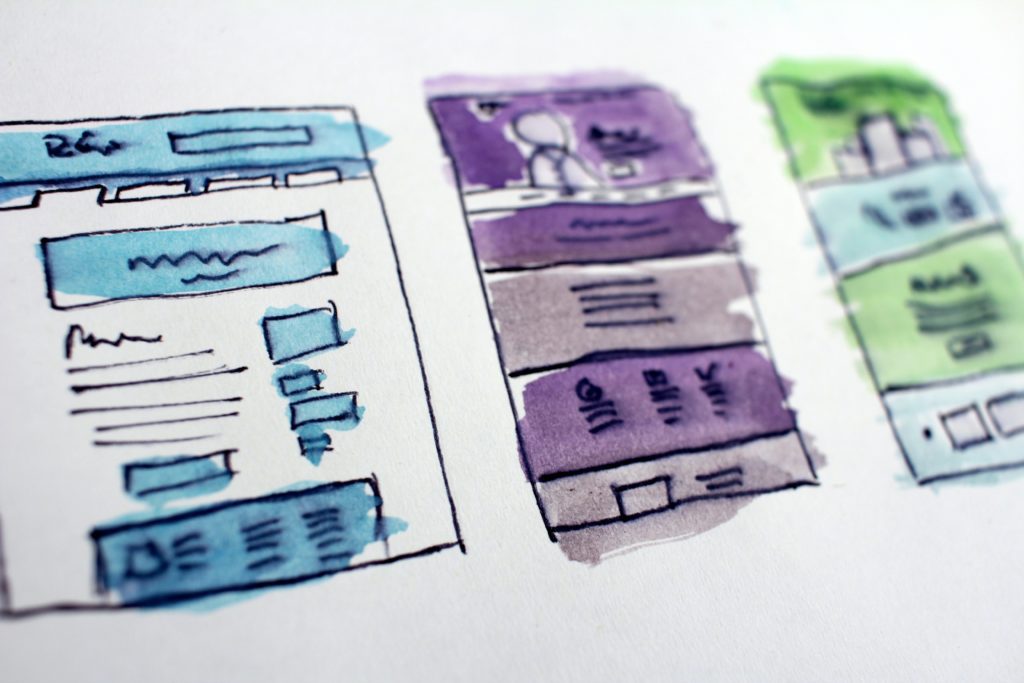
B2B web design best practices
Before we look at some real-world examples of B2B web design, let’s talk about best practices.
Tip 1: Make your 60-second pitch on the home page
B2B websites are chock-full of information about products, features, pricing, support, and so on. When sharing so much information with B2B prospects, you need one page where it all gets summed up. And that’s your home page.
Think of the home page as the highlight reel for your business. What do you sell? What does your product actually look like? How does it affect your business buyers and their organisations? What makes your solution stand out from the competition? What do existing customers have to say about it? All of this (and more) should be right up front.
Tip 2: Keep the navigation simple and well-organised
A B2C website can give customers a list of categories and subcategories of products, and then leave them to the task of finding what they’re looking for. With B2B, you don’t have that luxury.
B2B websites generally have dozens of pages devoted to products, features, resources, company information, and so on. Trying to fit them all into the navigation would be a bad idea. Here are some general rules to follow when designing your B2B menu:
- Create a top-level menu structure that logically takes prospects through your offering, from discovery to purchase.
- Drop-down menu links should be well-organised. You may need to include headers and use multiple columns to do this.
- Place non-priority pages in the footer of your site so you can free up space in the main navigation.
Read what is UX design and how it fits into a B2B website for enhanced navigation.
Tip 3: Design the site for users at different stages of the buying journey
Your B2B website should be able to:
- Attract leads through SEO and digital marketing.
- Collect contact information from leads in the discovery and research phase.
- Move qualified leads who are ready to buy into the sales funnel.
As such, your site needs to be equipped with messaging and tools that keep prospects moving forward no matter where they are in the buying journey. While your copywriter will be able to sort out what messaging to use, you should also be thinking about ways to design your call-to-action buttons and forms, so they’re easy to find and interact with.
Read how to align UX, content and design in a B2B website.
Tip 4: Build trust into your design and content
The stakes are much higher for B2B customers than they are (usually) for B2C. What they’re buying from you is going to impact them, their team, their company, and may even extend to their customers and partners. This is why B2B sales can take so long to happen.
To simplify the buyer’s decision-making process, design your website with credibility and trustworthiness at its core. Some ways to do this are:
- Social proof in the form of customer logos and testimonials
- Transparent pricing and fee structure
- A free trial or demo period
- Readily available resources and support
- Trust marks like security logos and money-back guarantees
If you want to put their minds at ease, trust needs to be baked into your site.
Inspiring B2B web design examples
Want to see these web design best practices in action? Here are 10 B2B websites that get it right:
1. Abusix
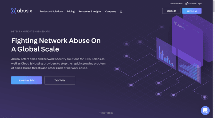
Abusix helps companies in the Internet, telecom, and cloud spaces to secure their networks and emails. Considering the serious ramifications for a business if they choose the wrong security solutions provider, there’s really no other way to sell this kind of solution than with trust. And that trust-building has to begin on the website.
While this site is generally a great example of what great B2B web design looks like, it’s the way it builds trust that you should really pay attention to. High-profile tech companies like DigitalOcean, StackPath, and Vodafone have lent their names, logos, and, in some cases, testimonials in support of what Abusix does. The way they’re visually integrated into the design ensures that prospects won’t miss a single one of these supporters either.
2. Buffer
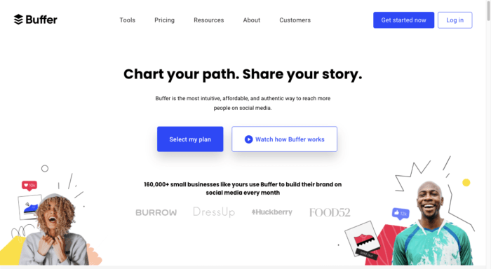
Buffer is a social media management platform for small businesses. Because Buffer targets small businesses, its web design differs from a lot of high-tech and enterprise-targeting sites. While it still covers everything a typical B2B site should cover — e.g. Tools, Prices, and Resources — the vibe is very different. It feels more dynamic and adventurous.
Something else that makes this B2B site feel different is how it builds trust. While there’s some social proof here, Buffer uses storytelling, video, and blog content to drum up interest, build credibility, and drive visitors to conversion.
3. FreshBooks
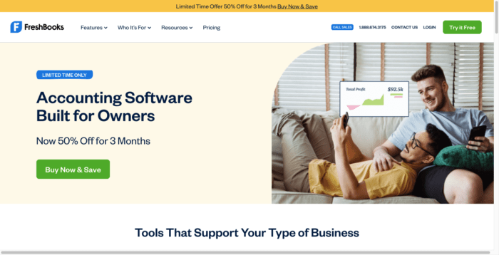
FreshBooks is an invoicing and accounting software for business owners.
Now, one of the biggest difficulties in trying to sell software is the complexity of it. In the case of accounting software, FreshBooks not only has to simplify the technology for prospective users, but also the accounting piece of it. It’s quite the challenge.
But this site handles it brilliantly. All the features are broken down into the smallest parts and relevant graphics are used to show how the software solves business owners’ financial management needs. What’s more, the site has pages dedicated to different types of business owners, like freelancers vs. businesses with employees. This way, FreshBooks can address each of their needs in a uniquely personal way.
4. monday.com
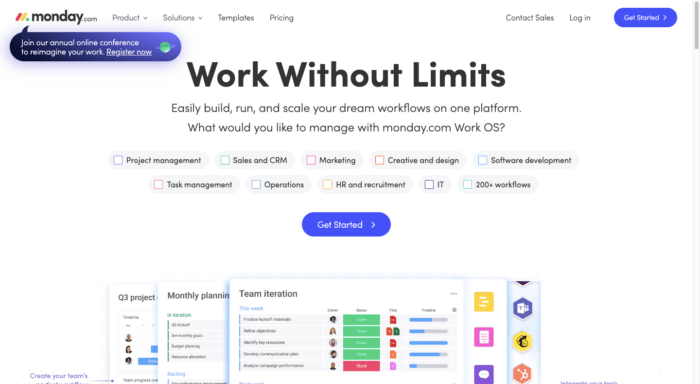
There is a ton of competition in the project management space these days, which is why monday.com’s website is a standout. Right from the very start monday.com gives prospects and customers alike a major value-add, offering them a free invitation to join their annual conference. And because this pop-up is designed unlike most pop-ups people see online, it’s certain to capture their attention right away.
As for the rest of the website, the design is smart and strategic. For instance, the hero image poses a very basic question to visitors:
“What would you like to manage with monday.com Work OS?”
It then anticipates what their answers (and needs) are. In addition, the boxes in the hero image can actually be checked off. If a B2B website can get users engaging the second they step inside it — and a needs checklist is a good way to do that — it’s off to a good start.
5. PathMotion
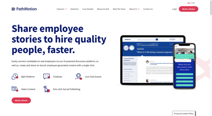
In marketing, there’s perhaps no currency more valuable than user-generated content, as it enables existing users and customers to become advocates for a brand. PathMotion is an AI-powered solution that takes that concept and internalizes it. It empowers brands to create and share employee-generated content in order to attract and hire better employees.
Despite how robust this solution is, the website does an excellent job of breaking it down with easy-to-understand descriptions, supporting graphics, and social proof.
What’s more, the web design doesn’t go overboard. There’s a ton of information for visitors to get through, so the ample amounts of white space, well-structured navigation, and hierarchical page structures will improve their ability to focus and fully digest what they’re reading.
6. Pipedrive
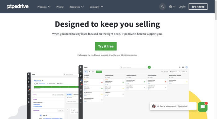
Pipedrive is a customer relationship management (CRM) software.
Many CRM solutions market themselves as all-in-one management solutions for every part of business: sales, marketing, support, commerce, and so on. This means their sites are jam-packed full of information on everything their platforms do. Pipedrive isn’t doing this and that’s why its site is so effective.
The design of the site makes it easy for B2B prospects to learn all about the CRM. What’s more, the second they’re ready to take action, all they need to do is look for green. From the very start, visitors are conditioned to associate green with action. The “Try it free” button. The live chat widget. The FAQs highlighter. Green means go. So, once they’ve learned all that they need to, they can quickly take the next step.
7. RingCentral
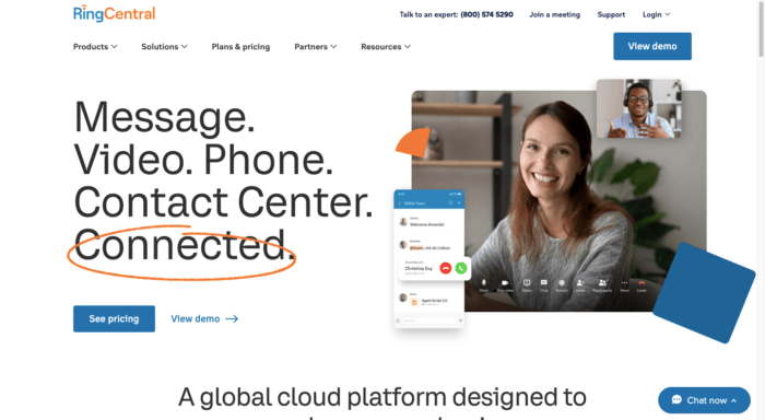
RingCentral is a cloud-based communication platform for businesses. While the primary goal is to get visitors to sign up, you can tell that this site was designed to remove the pressure from the buying process. For instance, the design feels inviting, with hand-drawn elements used throughout. It removes a lot of the coldness often seen in B2B technology web design.
Empathy also plays a big role in the design choices. While RingCentral could easily brag about how popular it is with well-known enterprises, each page instead feeds visitors with valuable information and resources they’ll need during the discovery and research stages. And for those B2B buyers who are approaching the final stage, pricing and demo links are always readily available.
8. Semrush
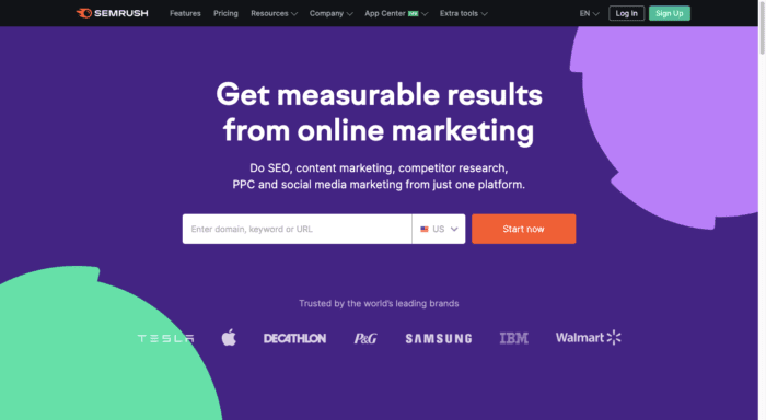
Semrush is a digital marketing platform that specialises in helping businesses monitor and manage their online visibility. While it offers tons of free resources to anyone who wants them, the platform itself comes with a lofty price tag. Because of this, the Semrush website has to be designed to attract and get the right kinds of B2B customers into its sales funnel.
The site’s search optimization and pay-per-click campaigns certainly help with this. However, what happens when someone looking for a free or cheap SEO tool ends up on this site? The first thing they see is a list of companies like Tesla, Apple, and Walmart. That alone should help visitors self-qualify and decide if the platform is right for them.
As they move through the rest of the site, the supporting information and social proof will further help push highly qualified leads through its funnel and the not-so-qualified leads to its free resources.
9. Wistia
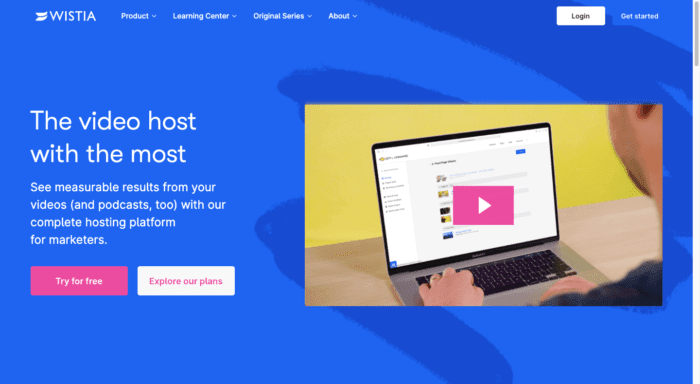
Wistia is a video hosting platform built specifically for marketers. We obviously know this from the content on the site, but the web design is also geared towards more creative and marketing-minded professionals with tons of colour, short impactful blocks of content, and embedded video messages.
Another noteworthy B2B feature is the navigation bar. In many cases, navigation drop-down menus provide us with nothing more than links to explore the products, resources, and so on. However, Wistia’s navigation provides context for each section. For instance, the Product drop-down explains:
“Use our software and your videos to grow your business.”
It then organises the features of its product and their corresponding links under Create, Present, and Grow labels.
10. WP Engine
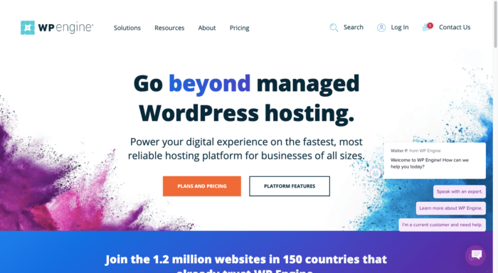
WP Engine is a company that sells managed WordPress hosting services to website owners and web developers. It’s a highly competitive space to be in, so the website needs to make a solid impression on prospects.
Except for the hero image, the rest of the home page is dominated by social proof and trust marks. This is one way to assert dominance in this space and to gain the trust of people who might be on the fence about having someone else manage their website. The live chat pop-up is another good design choice. The message reads:
“Welcome to WP Engine! How can we help you today?”
The live chat’s pre-written responses then serve as a go-between for the company and its users. Based on their response, the live chat can identify what type of help they need and whether or not it can be offloaded to the website or if a specific team member should get involved.
Wrapping up the best B2B web designs
A B2B website needs to do more than just look good. If it’s not working for you — i.e. attracting leads to the site, getting them into your sales pipeline, and converting them — you’re missing out on a huge opportunity.
Thankfully, you’ve come to the right place! If you’re in the market for a new B2B tech website, or need an existing one retooled, we’d love to talk to you.

How great B2B websites can shorten sales cycles
Internal day: September 2021
Let's Talk
Do you have a web design and build project coming up that you would like to talk about?