9 great examples of B2B SaaS website designs

Whether you’re just entering the SaaS space or you’re looking to get your product in front of more users, now is the perfect time to get your digital experiences in order. According to Henrique Cecci, the senior research director at Gartner:
“The economic, organizational and societal impact of the pandemic will continue to serve as a catalyst for digital innovation and adoption of cloud services. This is especially true for use cases such as collaboration, remote work and new digital services to support a hybrid workforce.”
It’s not just the pandemic that has changed the way businesses operate. For years now, companies have focused on greater globalization of their workforce, improved efficiency levels, as well as better data management. Cloud-based products have answered the call.
But you know that already. What you need now is a way to improve the visibility of your SaaS in a growingly congested market — and it all starts with your website.
If you want to see what it takes to get your site in front of more prospective users, generate more leads from it, and get more sales, the following 9 great examples of B2B SaaS website design are sure to inspire you.
Is there a difference between good B2B web design and SaaS?
We recently shared 10 of the best B2B web design examples of 2021 with our readers. While those web design best practices are just as applicable to B2B SaaS websites, there are other considerations to keep in mind:
Navigation should take visitors on a journey
The SaaS buying process can be a lengthy one. According to Gartner, 60% of that process takes place before the buyer ever engages with the SaaS vendor.
So you need your website to be the self-service guide that takes prospects from the discovery phase to ready-to-engage. Having a navigation that logically takes them on that user journey will help.
Content needs to remove the intimidation from tech
Even if your SaaS product promises to remove the complexity and friction from a business’s operation, prospects may be scared off by the seeming complexity of the technology behind it. Bearing in mind the multiple stakeholders involved in the decision, many of whom may not have technical backgrounds.
Your website needs to keep that intimidation from entering the decision-making process. While your copy can help to alleviate those concerns, certain web design choices can also impact the perception of the product’s complexity or lack thereof.
Website performance is a direct indicator of your product’s performance
Your SaaS website will play several roles — it needs to attract prospects, educate them, and drive them to conversion. It also serves as the home base where existing users log in. Because of this, the experience needs to be flawless.
When prospects or users encounter errors, slow load times, outdated designs, and other issues, the poor experience won’t just influence how they feel about the site. It’ll cause them to question what the experience will be like if they invest in your product.
Make calls to action as inviting as possible
From freelance creatives who work alone to massive financial services organisations, SaaS can be majorly transformative to the way businesses operate. But with this transformation comes disruption — and the anticipation of this disruption can be a serious hurdle to conversion.
Whenever possible, your website should include calls to action that aren’t as intimidating and don’t feel as binding. So, instead of hitting visitors over the head with calls to “Buy Now”, try friendlier ones like “Free Trial” or “Schedule a Demo”.
Flaunt your social proof
Security trust marks are important in B2B web page design in general. However, SaaS companies should also be building trust through social proof; evidence of successful product use cases which prove the value of investing. Prospects need to see that any disruption caused by the software during onboarding will be worth it in the end.
As such your SaaS website should show off impressive statistics about who uses your product while also displaying logos and testimonials from high-profile companies that vouch for you.
Great examples of B2B web page design for SaaS
If you’re looking for inspiration for your web page design (or redesign), the following SaaS websites are great examples to follow:
1. Atlassian
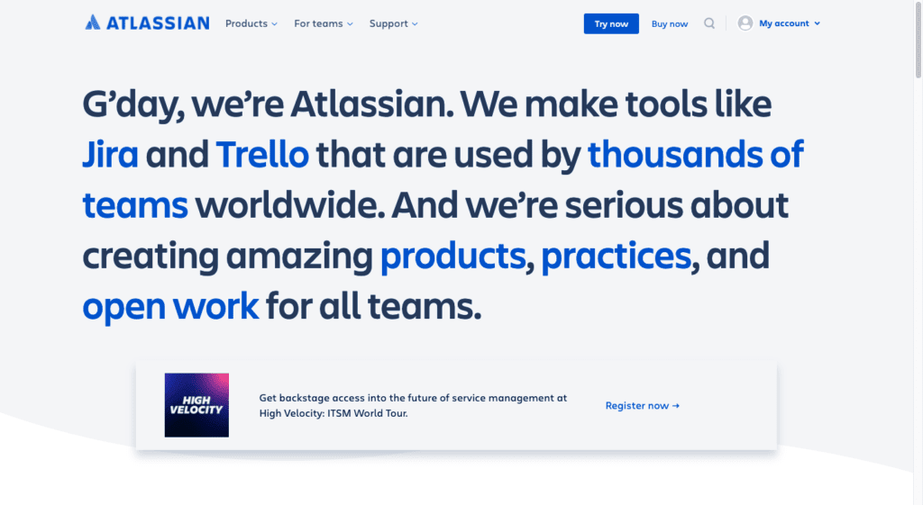
Atlassian has developed and amassed a wealth of digital B2B products. This can pose a challenge for some web designers.
Take, for instance, a company that sells one product. It’s clear what the focus of the site is. With a dozen or more products though, it’s all too easy for the home page to be overrun with information and products competing for attention. Atlassian hasn’t made that mistake.
Instead, this home page is a great introduction to Atlassian’s mission and how the product suite fulfils it. What’s more, Atlassian’s web page design is reflective of the user-friendly interfaces that users will encounter within their products. Information is plainly stated and supported by eye-catching, supportive but not overly distracting visuals.
2. Canva

Canva is not designed like most B2B SaaS websites.
There’s usually a predictable structure to the way the website and, in particular, the home page is laid out. It starts with a summary, describes the product benefits, highlights the standout features, shows off customer testimonials, and so on. Canva doesn’t do that.
Instead, it gets prospective customers right into the thick of things by asking: “What will you design?”. If the question is compelling enough, a click on any of those design types will instantly take prospects into the Canva editor. They get to experience the design tool first-hand without the need to sign up or buy anything — a highly effective way to sell a SaaS product.
3. ClickUp
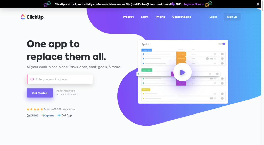
ClickUp is a beautifully designed modern B2B tech website that makes use of design trends like animation, video, and colour gradients to hold visitors’ attention. ClickUp also spares no expense when it comes to showing off its product.
One of the challenges with entering a space like project management software is that it’s highly competitive. While your website could easily tout the features and benefits of your software, they might not sound all that different from the likes of Asana, Trello, or Monday.com.
But by showing users what the app looks like — not just through static imagery, but also explanatory GIFs — ClickUp can make a more compelling argument for its software, and quickly too.
4. ContentSnare

Content Snare is a product built specifically for people who need to get content and answers from clients. It can be an incredibly stressful task and, if not done properly, can have negative ramifications for the project as well as the business as a whole.
That’s why this particular B2B web page design is so brilliant. The no-frills design and empathetic, conversational copy quickly addresses the users’ pain and efficiently spells out why this is the perfect solution for them.
Client management can be a huge source of pain for creative businesses, so the no-time-to-waste approach with this web design is perfect for the target audience.
5. Grammarly
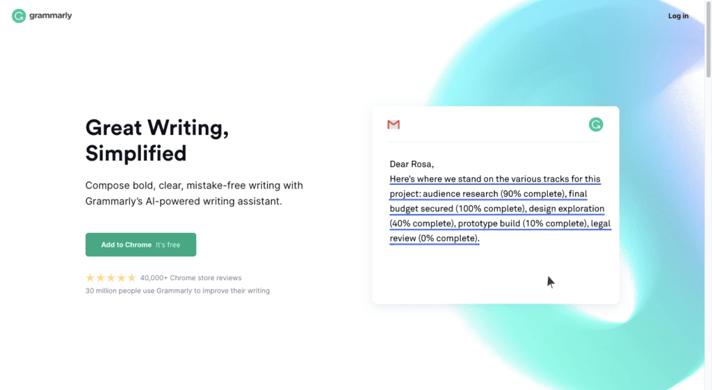
Grammarly is the only SaaS website on this list that doesn’t have a menu in the header. There is just a logo and Log In link. That doesn’t mean there aren’t other pages on the site. If you go to the footer, you’ll see them broken down logically — the way you’d normally see it presented in the header.
For more complex products, this would be a no-no. However, Grammarly is an AI-powered writing assistant. It provides users with a distraction-free space to write and to check their text for errors. So, there isn’t a whole lot to explain since most people are well-acquainted with spelling and grammar checking tools.
Instead, Grammarly uses the home page to show prospects the value of its AI-powered solution, through descriptive GIFs, information on its unique features, as well as social proof.
6. QuickBooks
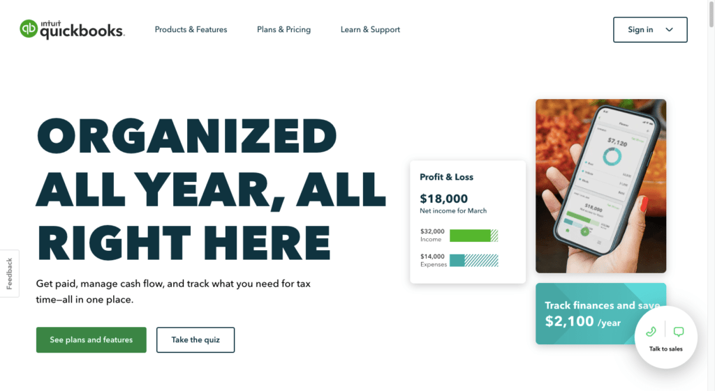
B2B financial services tend to be more reserved when it comes to messaging and web design. That’s not the case with the QuickBooks website.
The home page design is big, bold, and hard to turn away from. This is another one of those examples where the product is self-explanatory. If a user has found themselves here, it’s because they need help with accounting. So they don’t need QuickBooks to spell everything out. What is important, however, is that they see how the app will help them.
That’s what this design allows them to do. The site is efficient when it comes to copy, making room for supportive graphics and eye-catching GIFs that highlight the best features of the product.
7. Salesforce
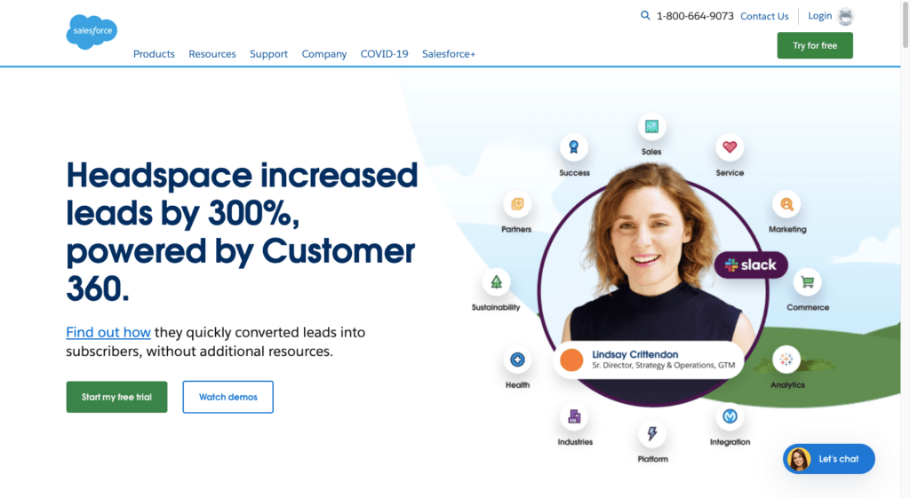
Salesforce wasn’t the first customer relationship management tool, but it’s certainly been a leader in the space since the turn of the century. As a result, its website isn’t designed like most SaaS companies (nor should it be).
People who arrive on this site most likely know what Salesforce is. So, rather than provide basic information on the benefits of a CRM, the home page dives right into closing the deal. That’s why there’s a brief case study — showcasing a famous company called Headspace — in the hero image and why the remainder of the home page “talks” to visitors in a casual and friendly manner.
This is one of those examples that demonstrates the importance of knowing who your target users are and then designing the most welcoming experience for them.
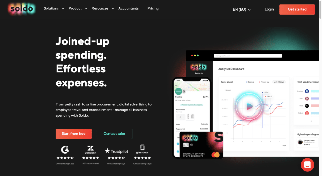
8. Soldo
Soldo is a great example of storytelling through web design. For starters, the navigation clearly explains who the solution is for, the products that can help them, the resources that’ll support their usage of the product, and so on.
The home page also does a nice job of courting prospects through the sales process. It starts with discovery — clearly explaining and showing what the SaaS company does. It then sets users on the path of consideration, using a combination of white space, beautiful gradients, useful visuals, and compelling copy along the way.
By the time they get to the call-to-action at the end, it’ll be hard to say no.
9. SurveyMonkey
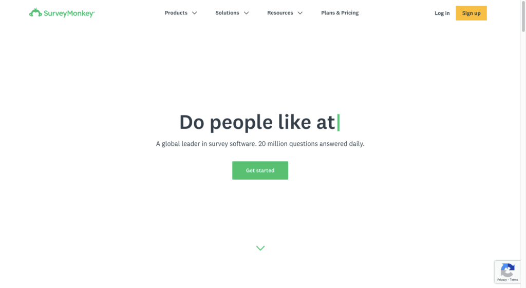
SurveyMonkey has one of the least flashy SaaS web page designs on this list. However, its abundant use of white space and minimal graphics works well for them.
SurveyMonkey is a tool that enables businesses to get inside the minds of their audience through surveys. So, it makes sense that the words on the website would be allowed to outshine the graphics. It also helps that the first thing visitors see on the home page is a series of questions written out using an animated typewriter effect.
The super minimal web design enables visitors to focus more easily on what SurveyMonkey has to say about its product and to not get distracted by unnecessary or excessive content.
Wrapping up
SaaS adoption has recently sped up, which makes now the perfect time to make your mark on the space. Just make sure your B2B SaaS website is ready to compete in the market.
A SaaS website needs to be more than just a great-looking digital shop window. While the latest design trends may help you get noticed, they won’t be enough to close the deal with most prospective customers. Instead, follow the lead of the examples above and create an on-site experience that guides them through the decision-making process and removes any concerns or doubts that may spring up along the way.
If you’d like help with building a high-performing website for your B2B SaaS or tech business, let’s talk.

Top 9 B2B web design trends for 2022

What can B2B marketers learn from B2C web design?
Let's Talk
Do you have a web design and build project coming up that you would like to talk about?