10 great B2B website designs for growth

Your B2B website provides a unique opportunity for your business to boost sales through inbound marketing, and provide a smooth user experience to reduce the friction of the buyer journey. Effective B2B website design focuses on much more than colours and aesthetics. The best B2B web designs minimise bounce rates and promote leads.
Still, a B2B website needs to be captivating, alluring, and innovative. Successful sites keep up with the latest B2B web design trends. From straightforward navigation, intuitive chatbot customer service features, and micro-interactions, these trends are easily spotted in some of these fantastic B2B website designs to be used for inspiration.
Designing B2B websites well is key. Beyond design elements, the website needs to be mobile-friendly, coded for speed optimisation, and designed for engagement and SEO to improve the user’s experience. Let’s explore some fantastic B2B websites mastering their website design.
1. Asana
Asana’s website is tackling several B2B web design trends perfectly. Above the fold, they have intentional animations, the white space lets typography and messaging shine through, and high-quality photography makes it look polished and professional.
But, they’re relying on a key B2B web design trend: data visualisation. These elements are incredibly helpful in the SaaS space because they simplify complex information. The interactive timeline design and other small infographics explain how teams can benefit from the platform.
Asana’s homepage doesn’t use the traditional B2B lead generation format of the contact form. Instead, the call-to-action buttons take the user immediately to a signup form to kickstart the process. This gives the user control of their experience, helping them believe they’re autonomously deciding to choose your company.
2. Dropbox for Business
Dropbox also leverages interactive animation to show users what its software can do beyond words. Intentional animations are incorporated into B2B websites to steer the audience to take action. For example, a pulse animation calls attention to a button or an action.
Instead of incorporating animations for the sake of it, designers are now looking at how animations can serve a specific purpose that grabs the user’s attention, reinforces brand messaging, and triggers an action.
Dropbox’s B2B website has a straightforward design that focuses on solving problems. Most importantly, their call to action button says “Find the plan for you,” which takes the user down a discovery journey and feels less intimidating at first, likely resulting in higher conversions and a better user experience.
3. Mitie
Most B2B buyer cycles are based on trust. Efficient B2B websites have a way of transcribing that trust through design elements and characteristics that make users feel confident about their decisions. In the case of a B2B website, trust markers such as customer testimonials, companies that already use your product, and partnering companies highlighted on the site can add that element of trust.
For example, Mitie, throughout their homepage, uses trust markers to showcase their high-profile clients. They reveal statistics that express the scale of their operation, and they even share various accolades they’ve received.
Though not all B2B companies will have these trust marks, including testimonials or social proof is paramount to establishing that reliable connection with the user.
4. Xpedition
The Xpedition B2B website is an excellent example of how companies can use storytelling to simplify their services through effective web design. The hero does a great job removing the fuzz and explaining precisely what the company offers.
The simple navigation walks users through the buyer funnel seamlessly and effortlessly. Using these design elements to kickstart the buyer journey creates an effective B2B web design that focuses on lead generation.
Then, the homepage sections each industry they work with to separate the journeys and offer users a more personalized experience. The combination of simple elements, intentional interactions, and clear call-to-action buttons makes this an incredibly efficient website.
4. Hootsuite
Most B2B websites tend to have dozens of pages that can crowd the navigation. Hootsuite does a fantastic job leveraging its simple navigation with only three top-level menus that steer their audience in the right direction.
Interestingly, Hootsuite doesn’t rely on trust marks or social proof to position themselves as the leading social media platform. Instead, they highlight their products’ benefits and how they can be a solution to its potential customers. They are great at outlining the features and benefits of their services while taking the user through a rundown of the experience.
The homepage doesn’t focus on many details but instead on the overall experience of their services. And the playful design paired with white space makes the site feel more user-friendly, which can attract many B2B customers looking for easy solutions to implement with their teams.
5. Mailchimp
Mailchimp is much more than an email marketing software. Today you can automate your marketing efforts, design websites and stores, and even use audience management tools. With so many product options to choose from, their B2B web design simplifies them all in easy-to-process snippets.
Mailchimp relies on white space and bright imagery to get its points across, along with simple navigation that walks users through the buyer persona in an informative manner.
Something else that Mailchimp does very well is highlight its credibility with trust markers like customer logos, accolades, achievements, and case studies that show the benefits of using its services.
6. Learnosity
The perfect example of a fantastic B2B website design in 2022. The Learnosity homepage blends trending web design elements like white space, customer support, intentional animations, and micro-interactions for a fully immersive user experience.
By merging micro-interactions with animation, Learnosity can keep the user engaged on the site while providing a more meaningful user experience.
The sticky navigation brings the call to action button with the user throughout the website, while the company’s content focuses on sharing the benefits and value proposition. Altogether, the site lets the user hyperfocus on the content and the different products to decide.
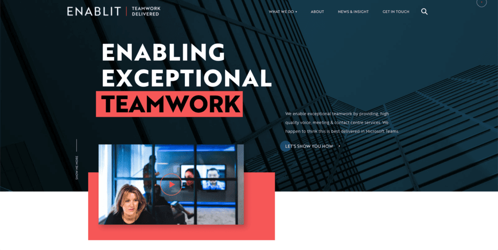
7. ENABLIT
On the surface, the ENABLIT web design is flat, but it’s still sleek and attractive to users. The hero focuses on another big trend this year: typography. A play of typography and white space lets the headers shine on their own as the user focuses on the content. Strategically placed call-to-action buttons only trigger by hovering, ridding the sales-y component so dreaded by many B2B tech companies. This enhances the user experience by letting them find the CTAs when they’re ready.
In addition, they incorporated micro-interactions throughout the site. Micro-interactions are short but significant interactions such as rotating cards, sliding animations, and dashed indicators that make the website seem more responsive. Plus, micro-interactions also help the user feel more confident throughout their site navigation.
8. Zendesk
Zendesk’s web design is the perfect example of what companies in a competitive B2B market should do. Every element of its website focuses on incorporating trust markers. They do this by pairing service and feature descriptions with customer testimonials. Instead of breaking the content with imagery, they use social media proofs and accolades that speak to their trustworthiness and capabilities.
The focus is so heavily invested in trust markers that there’s not much space on the homepage explaining the services. Instead, they leverage the power of the companies that use Zendesk and customer stories to start the buyer journey.
9. Blake Envelopes
Not all B2B enterprises are about exciting technologies and services. Blake Envelopes can take something as mundane as envelopes and turn it into a luxury product that exudes trust, craftsmanship, and quality. The homepage focuses on one thing only: highlighting their beautiful envelopes.
They understand that they don’t have to explain much about their services and instead focus on displaying the wide range of products they can offer companies. Keeping it simple brings all the attention to the products rather than the company. The same can be seen in their navigation, which takes the user through a range of solutions that simplifies their search and, consequently, their buying journey.
10. PathMotion
The PathMotion website is an excellent example of how iconography and intentional animations can bring interest to key brand messages. Instead of important information getting buried in paragraphs, they rely on easily recognizable icons to share information. Paired with this, they use intentional animations to draw attention to their trust markers, to show the company’s achievements and statistics relevant to potential buyers.
PathMotion also relies on intentional micro-interactions to create a dynamic experience that breaks up the flat web design. With bulleted lists that change imagery to display the specifics of those functionalities, it’s a more impactful way to explain what the company does.
Wrapping up the best B2B website designs
To compete in this new B2B landscape, you need to consider the latest B2B web design trends to have an effective website. You need to give users a top-notch online experience that starts with the website, with strategic call-to-action buttons.
There’s a lot to learn by looking at how leading B2B enterprises design their website. This way, it’s much easier to recognize the elements that stand out to see how you can incorporate them into your website.
If you’re looking to redesign your B2B website, check out a few of our case studies for inspiration.

How marketers can prepare for a B2B website project

The best analytics to track for conversion rate optimisation
Let's Talk
Do you have a web design and build project coming up that you would like to talk about?