Create a simple WordPress reporting dashboard with Google Data Studio

Google Analytics has always been an incredibly powerful and useful tool when it comes to analysing your websites and monitoring the success of your marketing efforts.
However, it also had some shortcomings. One major annoyance for users was the difficulty when using Analytics together with other platforms. They wouldn’t work together, which meant users had to constantly jump between dashboards in a range of different panels.
It was time-consuming and inconvenient, and the inability to consolidate data in one place made it tough to look for overall trends and insights across platforms.
Now, things have changed. Google Data Studio allows users to combine all Google’s analytics tools, and also introduce third-party data from social media sites, Facebook ads, and more.
Data Studio allows you to build your own website reporting dashboard, bringing all your reporting platforms together in one easy-to-use interface. It’s a real asset for marketers, and indeed for anyone who wants to track the performance of their website and brand in one place.
In this article, we’ll walk through how to get started with Data Studio and introduce some of the most useful features.
Before you start
A crucial first step is to think about what direction you want to take with your analysis. Take some time to decide what your goals are and what specific metrics you want to measure.
By deciding on a rough direction at the start, you’ll be able to build your dashboard more successfully, focusing on a select few useful metrics instead of trying to measure everything and becoming overwhelmed.
Your first report
Once you have a rough idea of what you want to accomplish, it’s time to sign in and create your first report. Here’s how to get started:
- Using your Google Analytics account, sign in to Data Studio
- Select the option to start a blank report
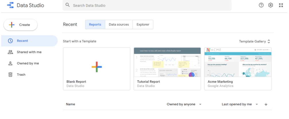
- You can give your new dashboard a name at this stage
- Add your first data source. Click ‘create new data source’. In the left sidebar, you’ll see a list of possible sources like Google Analytics, YouTube Analytics, AdWords, and more.
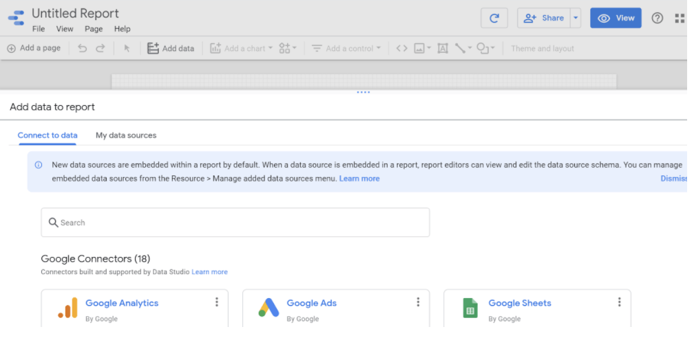
- Select the one you wish to add and authorise the connection if necessary. Once done, you can rename the connection for future convenience.
- Click ‘add to report’
Nice job! You’ve now created your first report. Go to the report editor page, which is where you can make most future changes. Now let’s take a look at some of the actions you can take from here to build out your report and improve it.
Add a second data source
It’s likely you’ll want to use more than one data source in your dashboard. Fortunately, adding new sources is a simple process. Here’s how it works:
- In the top toolbar, go to ‘resource’ and select ‘manage added data sources’
- You’ll now go to a panel where you can manage all your data sources in one place
- To add a new one, click ‘add a data source’
- Now just follow the same steps as before, including authorisation if needed
Add charts, controls, and other components
Components like pie charts, grids, and bar graphs can be a really useful addition to your dashboards. They make information much easier to present and digest, so you can not only follow progress more easily but also share it with other team members and clients more easily too.
Here’s how to add a feature, for example a chart:
- Select the option to edit your report
- Go to the page where you want the chart to be
- In the toolbar, select ‘add a chart’
- Select the type of chart you want to add
- Click the canvas to add the chart to the report
Once the chart is added, it’s easy to select it so you can move or resize it according to your preferences.
You can also add fields to your charts, like this:
- Select the chart or control you want to change
- Select the ‘data’ tab
- Search in the ‘available fields’ list on the right-hand side
- Find the field you want, then drag it into an empty slot in the dimension or metric type
You can also drag and drop fields onto the chart.
To replace fields:
- Select the chart or control you want to change
- Select the ‘data’ tab
- Search in the ‘available fields’ list on the right-hand side
- Drag the new field on the top of the one you want to replace
You can also add other components using the toolbar icons or insert menu, such as:
- Interactive components like dimensions filters and date range controls. You can also use the data control to allow viewers to make changes to the data in your reports.
- Design components like images, text boxes, lines and circles. These elements help make your report look more attractive, a bonus when it comes to sharing and presenting your data.
- Embedded external content like videos, Google Docs, and external websites.
- Community visualisations — components developed by partners and other Data Studio users. These can add new types of data visualisation and functionality.
Date range filters
Elements in your reports use the last 28 days as a date range by default. If you want to change that range and look at data from a longer or shorter period, it’s easy to do so.
- Go to the menu bar and select the ‘date-range’ icon which looks like a small calendar
- Drag the icon to the report editor
- Switch to view mode and select a new date range. If you choose 50 days, for example, the previous 50 days will be covered
Scorecard
Scorecards are a great way to visualise important info and KPIs. They can be used to present metrics like sales, bounce rate, minimum failure rate, and many more.
They show up as boxes of numbers in data studio, like this:
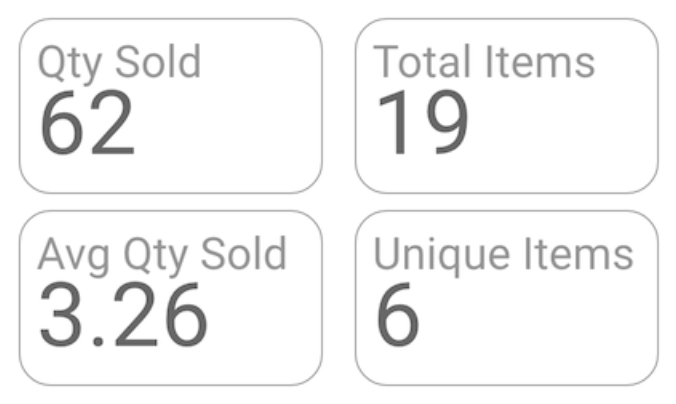
Here’s how to set them up:
- Find ‘scorecard’ in the menu bar and drag it into the report editor
- Select the ‘data’ tab and add the metrics you want to present
- You can adjust the date range as above to compare metrics over different time periods
Changing the layout
One neat feature in Data Studio is the range of options for customising how your report looks. This is yet another way to make your dashboards look more visually appealing and easier to analyse and share with others.
To get started, navigate to the ‘theme and layout’ panel and open the ‘layout’ tab. Here are some of the options:
- Headers. You can choose whether your headers are always showing, always hidden, or initially hidden until you hover the mouse over them.
- Display mode of report. You can decide if you want the report to fit to width (fit the proportions of the window) or remain its actual size. You can also choose if the report has margins or not.
- Change the size of the canvas
- Control the background colour of your report and any of its borders
Google Data Studio is a great way to bring all your analytics tools into one centralised and easy-to-use place. Its many features also allow you to build user-friendly and visually appealing reports, making it easy for your team to stay on top of your analysis and share findings with other parties.
To find out how 93digital can help you get the most out of Google Data Studio and a whole host of other marketing tools, get in touch with us.

93digital Shortlisted at the Corporate & Financial Awards

Meet the team: Hollie
Let's Talk
Do you have a web design and build project coming up that you would like to talk about?