Less is more (with Hick’s Law)


In 1947, architect Ludwig Mies van der Rohe coined the term ‘less is more’ to describe his aesthetic.
Rohe would employ a minimalist technique of arranging the components of a building to create an impression of extreme simplicity. Whilst we aren’t architect’s (in the physical structure sense), the ‘less is more’ mantra seems omnipresent in UX theory and no more so than Hick’s Law. Put simply;
Hick’s Law predicts that the time and effort it takes to make a decision increases with the number of options
Sounds simple doesn’t it? That’s because it is. The theory should be easy to understand and effortless to apply, but it is still often neglected in the dash to cram a website with as much content and functionality as possible.
How does Hick’s Law work?
Overloading a user with decisions is not the best approach in today’s day and age – where the breadth of information is larger and attention spans are smaller. For this reason, Hick’s Law is best applied where response times are critical.
Keeping choices to a minimum will not only speed up the decision-making process, it will minimise user stress and cognitive load. If users end up stuck in the decision-making process of “what next?”, they may become confused, frustrated, or leave your website.
This can be illustrated in the simple analogy of the humble road sign. “Road sign?” you say. Seems a little odd but consider the picture below:

Whilst no doubt a charming local quirk, imagine yourself as a tourist approaching these signs whilst driving. The myriad of options which includes routes to other towns, tourist attractions, and parking etc makes for pretty stressful decision-making.
If you’re in a rush, the more reckless driver might crash into the wall before they can decipher the signage, ruining their trip to Ireland entirely.
The more cautious driver would of course stop at the junction and begin the task of assessing the signage to make the appropriate decision, but the process is just as stressful. As well as the myriad of choices on offer, you now have the added stress of an impatient local behind you, beeping the horn. Stress increases, and you’re ushered into making the wrong turn.
In both cases, the common denominator is the number of choices displayed. It would therefore make more sense to create a singular sign either representing the key driving routes only, or at the very least grouping the information in a logical manner. The driver is given information in a concise format, meaning the sign is easier to decipher and the decision-making process is improved considerably. Tempers avoid getting frayed, and the trip to Ireland is a rip-roaring success.
How to use Hick’s Law effectively in UX & digital design
Back in the world of UX & web design, our signposts could be interpreted as the main navigation of a website. Best practice would see us employing no more than 7 items, so it is critical at the stage of creating a sitemap to ensure pages are categorised in a logical format that aides the user in navigating to content as seamlessly and as stress-free as possible. This is known as:
“Categorizing choice“
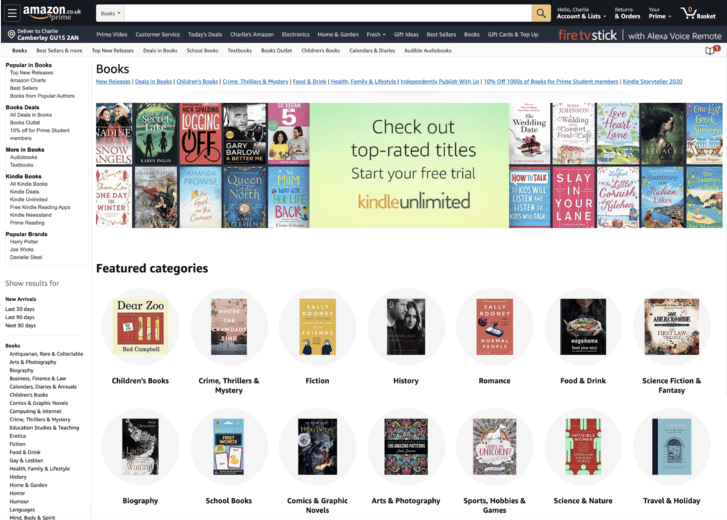
Categorizing choice is particularly useful when designing highly complex sites where Hick’s Law requires further implementations of choice. Think of Amazon for example, and imagine not being able to navigate beyond ‘Books’. Books as we know have a plethora of sub-categories – fiction, non-fiction, fantasy, self-help etc – and even have different formats such as electronic or audio.
If a user is directed to a screen with all viable options and no context, they will suffer immense stress in the decision-making process.
As designers we can scatter navigation items through the website in small, discrete clusters. These help narrow down huge volumes of information without overloading the user. Amazon have succeeded in this brilliantly with a comprehensive sub-navigation plus entry points within the actual content of the page itself.
To create categories, ‘card sorting’ has proven to be an excellent method. Requiring no more than paper cards, pens, and human interaction, it can provide a process for helping you to define the groupings of functionalities and terms.
Another means of employing Hick’s Law effectively is obscuring complexity. If you are designing a complex process, you can apply Hick’s Law to rationalise segmenting the process over numerous screens. Think of booking a flight online. It involves numerous steps – selecting flights, tickets, seats, baggage, etc. Imagine doing this on one screen? It would seem a little daunting and may cause fatigue within a user, potentially making them abandon the process altogether. They are upset because they haven’t been able to book the holiday they wanted, not to mention the company has made a loss. It’s a lose-lose situation.
Instead of throwing the entirety of the flight booking process up in a long, complex manner it can be broken down into logical steps on separate screens – i.e. Step 1: Choose destination, Step 2: Select flight etc. In breaking down the procedure into manageable chunks, the user is less overwhelmed with the information being offered, making them much less likely to abandon the process, as can be seen in the screenshot from the British Airways site:

When not to use Hick’s Law
Hick’s Law is not the cure to all ills, so it’s equally important to know when not to use it. It does not apply to complex decision-making. Those decisions typically involve extensive reading, researching, or extended deliberation, and Hick’s Law won’t be able to predict the time to make a decision.
Think about deciding on a restaurant, or picking an AirBnB place to stay for your next holiday. These types of choices are complex, requiring the user to weigh many options from a range of sources before they make a final decision. In these instances, Hick’s Law prediction will fail as it applies only to simple, quick decisions in an appropriate context.
Conclusion
If there is one thing Hick Law is a proponent of, it is that user’s time is precious. Time, for a user, is life, so you can’t afford to let bad design decisions steal life from your user. Where there are alternatives, nobody is obligated to stay on your website or use your products.
Sometimes complexity is unavoidable, especially when presenting a huge amount of information about technical products or intricate services but using Hick’s Law can help reduce that complexity by simplifying the decision-making process for users.
Get to know your users and actively interact with them. Guide them toward their goal by highlighting choices they care about in that context. In doing so you will optimise decision-making and speed up the completion of a task. Your user is happy, and so are you!
Internal day: June 2020

93digital named as finalists for ‘Digital Agency of the Year’
Let's Talk
Do you have a web design and build project coming up that you would like to talk about?