B2B web design trends 2023: Predictions by actual B2B web designers

Each year, agencies across the B2B web design sector release their blog post on ‘Top 10 web design trends 202_’, or ‘Top 10 UI trends 202_’. This trend of trend articles has become so commonplace that most agencies seem to recycle their previous attempts… and each other’s.
We’re not going to lie to you. Articles like these are clicky, and great for SEO. That’s why they’re so popular.
But that’s where ours starts, and theirs’ end.
The entire Clarity UX and Design team came together for an intense brainstorming session. We fought, we laughed, we cried… Well not quite… But we did get pretty passionate in our discussion about the current and future states of B2B web design in 2022 and 2023.
Negating these futile ‘Top 10 web design trends’ type articles, we want to deliver no-nonsense, honest, experience-backed B2B web design and user interface (UI) trend predictions for 2023, from the perspective of our expert team: Fenella, Frankie, Charlie and Nicola.
To kick off, let’s look at what’s been happening in B2B web design lately:
1. Bold design choices that cut through the noise
As digital and B2B further converge, businesses understand that a website is one of their best chances to make an impression on potential buyers. Layer this with competition as fierce as FIFA, and you’ve got websites that are going above and beyond web design expectations to cut through the noise.
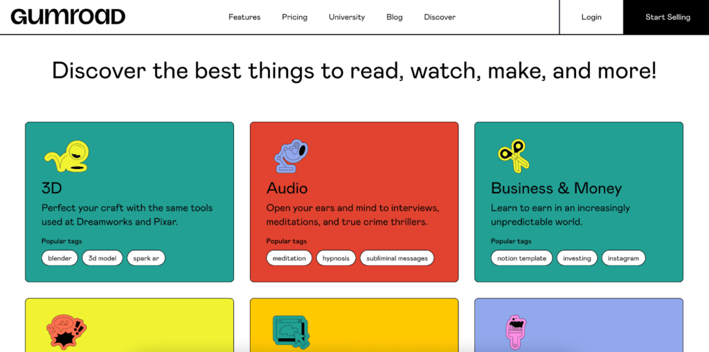
Gumroad.com is one example of a disruptive website using flat elements, bold colours, thick lines and other interesting features that, to some, might look a little… ugly (in a good way!)
Gumroad clearly understands their millennial audience, picking up on nostalgic themes of old school print, challenging traditional web design conventions to make a splash. They’ve successfully showcased their brand attitudes through the use of eye-catching web design.
Remember, a website’s look and feel is the best way to convey the personality of a brand.
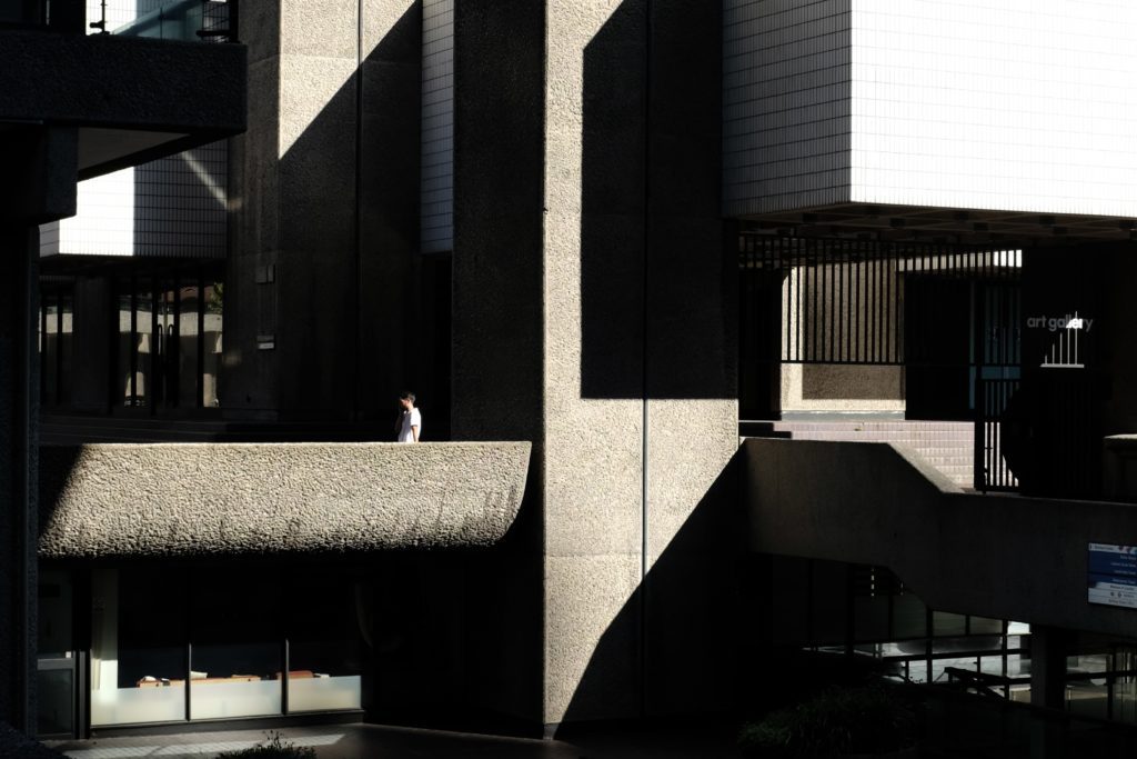
Our designer Fenella labelled this style brutalist. We can definitely see similarities between the above example and the Barbican. Can you?

Another bold design and UI choice is a maximalist approach – filling web pages to the brim with colour, graphics and images to make an impact. This approach is part of a pushback on the simple, clean styles that have been ubiquitous, especially in B2B tech.
More decorative text styles are moving away from simple sans serif, and many new rebrands are incorporating more decorative heading fonts and modern serif styles.
Brutalism and maximalism are ways to try to grab more attention from visitors, with styling that differs from the flat, simple, clean, friendly styles that have been so common, particularly in B2B tech, for so long.
2. Futuristic feels
In B2B UI and web design, we’re seeing a lot of futuristic inspired elements peppered across sites: Transparent objects, watercolour and glass spheres have all been trending over the course of this year. In B2B tech web design specifically, we’re seeing lots of Aurora backgrounds for an AI, floating brain, omnipresent intelligence kind of feel.
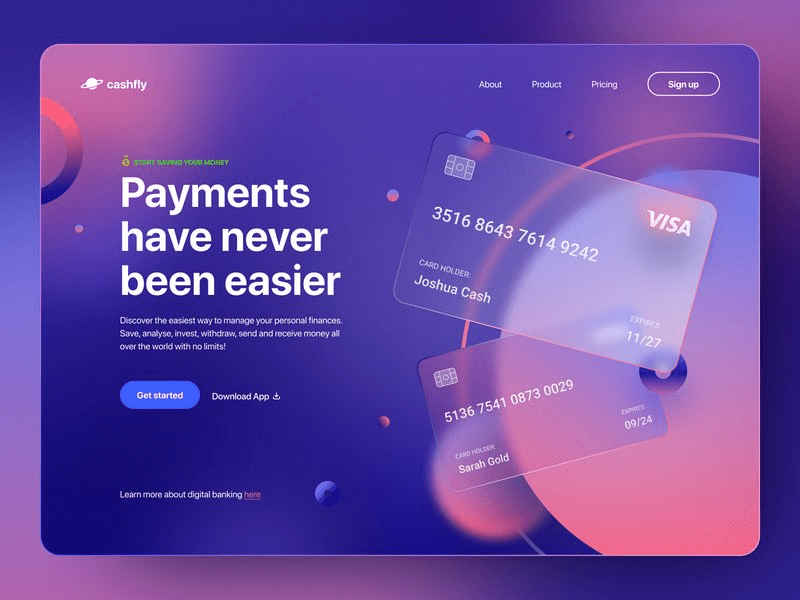
Furthermore, glassmorphism, similar to neumorphism, is a trend that combines elements of old fashioned skeuomorphism with more recent flat and material design styles. Take a look at this image as an example of glassmorphism, with a transparent credit card graphic:
Pushing the futuristic trend further, ultra-minimalistic design is growing more favourable amongst B2B companies who want clean, sophisticated websites. These kinds of websites are taking another approach to boldness, relying on white space and content to make an impact ahead of bright colours and funky shapes.
3. Bespoke, ownable assets that level-up creative control
The Clarity UX and Design team always try to sway clients from using stock imagery on their new websites. Why? Stock images come across as heartless and artificial. Just take a look at the first result for ‘business’ on a stock image search site:

Beyond the obvious reasons why stock images turn website visitors off your brand (see cringey high-five), bespoke images and graphics give B2B websites a certain uniqueness – an opportunity to showcase the personality of your organisation.
For more than decorative functionality, photography, branded graphics or unique illustrations and animations allow for more creative control, and more importantly, these emphasise and compliment the web page content.
These current B2B web design trends are all well and good, but what’s coming up in 2023?
Whilst reading the points above, if you’re a web design and UX professional, you’ll have noticed a major pitfall in all these trendy trends.
Have another read and see if you can spot it…
Got it? Well done! If not, we’ll explain:
Bespoke imagery and graphics, bold design choices that cut through the noise and futuristic feels all have one glaring thing in common, and it’s a nightmare for UX and web design professionals.
Whilst these trends look good, could win some creative awards and do represent the tone of a brand, these website design trends don’t put the user first, they put the business first!
Web design best practices hold true in the face of new and fast-moving trends. This means websites always need to be easy to use, and they need to have great navigation, no matter what. Visitors will leave your site, despite nice branding, if they can’t find what they’re looking for in the easiest way possible. That’s why UX is a B2B marketer’s secret weapon.
Sacrificing UX for a snazzy look will ultimately lead to higher bounce rates, lower conversions and less business impact! We can’t stress this enough: if you’re making your users work hard, you’re going to lose them.
Guiding attention and making interactions simple is really important, and trends like maximalism can take away from that. It’s important that decorative elements are used to emphasise the most important part and content of the interface.
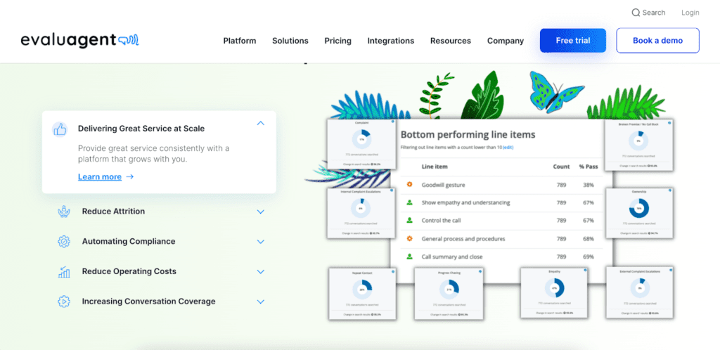
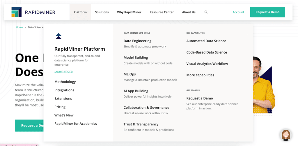
One example of strategic UX, that shows, is our work with RapidMiner and their ‘mega menu’. Like all our sites, this menu shows solid information architecture through the logical arrangement of pages, helping users easily navigate to the content they need, creating seamless UX.
What will great B2B web and UI designers be doing in 2023?
1. Mapping out routes across the site
As a first step in the web design process, in order to ensure easy navigation, it’s important to map out potential routes users will take across your site. Where might they land? And what information are they seeking out?
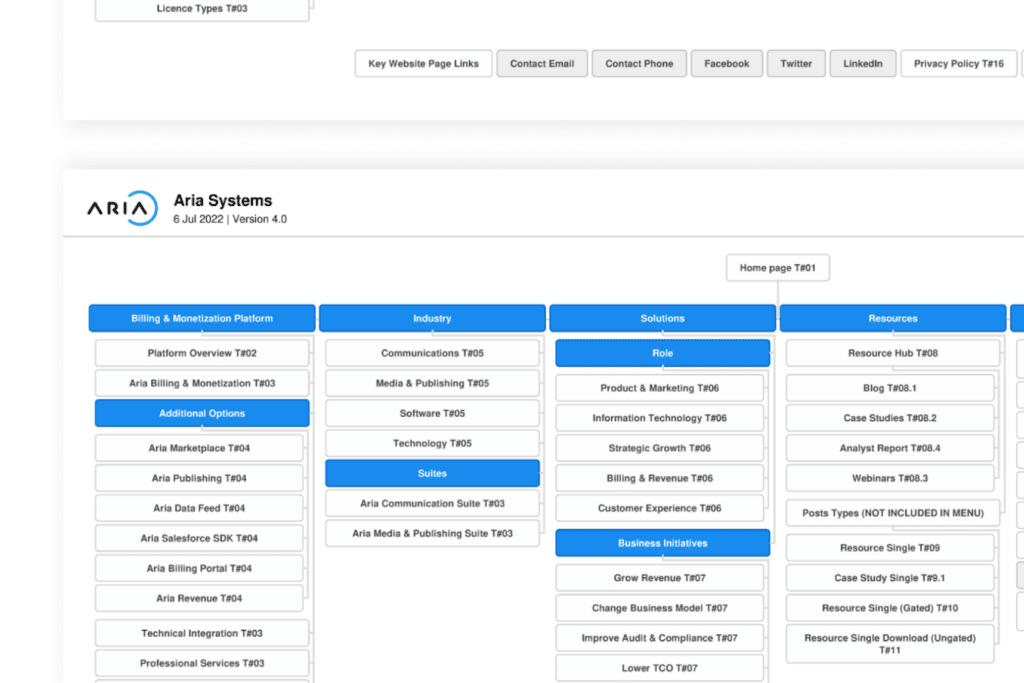
The Clarity team always creates a sitemap to see how our clients’ old site was built, and offer solutions to their previous challenges to find roadblocks in their user journeys.
2. Designing for content instead of the reverse
Before we even think about the look and feel of a website – colours, lines, graphics etc. – we always consider the content. Website content should always come before design.
As standard sites typically become more modern and user friendly, there’s an opportunity to win the attention of target audiences through content – a surprisingly often overlooked and undervalued website element.
Sites that can provide more useful content than others (based on user research) and tell a brand story, with compelling narratives about their offering, will gain a competitive advantage. This can be done by combining copy and visuals/animations/interactions that work together to make something truly engaging, rather than relying on purely decorative images.
3. Accounting for each stage of the B2B buyer journey
Content and user flows should both take into account the lengthy B2B buyer journey. Whether a user is at an early stage researching potential solutions, or they’re almost ready to buy, they should be able to access all the information they need to move forward along their journey.
Only after all of this has been researched and strategised should you start to think about the look and feel of your B2B website, when you can add glass spheres and bold colours to your heart’s content. It’s at this stage when we’ll often create a style guide to develop this, taking into account the brand’s mission, personality and values.
Wow, this article ended up a little preachy didn’t it… We told you our brainstorming session was rather passionate.
We hope we’ve gotten through! Put your users first, not your business needs. This is especially important to remember in B2B.
If you’re reading this article because you’re interested in rebuilding and redesigning your website in 2023, here’s a design brief template you can use to get across your ideas and plans to agencies. Hope it helps!
Celebrating 9 years of 93digital with our most seasoned team members

Why vision defines the world’s best websites
Let's Talk
Do you have a web design and build project coming up that you would like to talk about?